Crafting Killer Landing Pages in 5 Mins with DALLE 3
Welcome to the future, where creating a landing page doesn’t involve pulling an all-nighter or crying into your keyboard! Enter DALLE 3: the AI wizard that’s revolutionizing web design faster than you can say “Where’s my coffee?”
Understanding High-Converting Landing Pages
What’s a high-converting landing page, you ask? It’s that digital unicorn that magically turns visitors into customers. It’s not rocket science, but it does need a clear value proposition, a call-to-action that’s more tempting than a double chocolate chip cookie, and visuals that make your eyes pop.
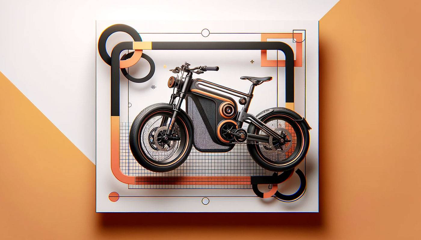
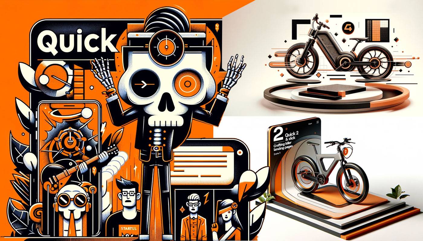
DALLE 3 Prompt: A stylish and clickbait horizontal cover image for an article titled ‘5 Mins High Converting Landing Page with DALLE 3’. The image should mimic the style of a render-based web design mockup for a funky e-bike startup. It should showcase a 3D render of an e-bike in a front view, rotating against a minimalist white background. The design incorporates bold geometric patterns and a color scheme of oranges and blacks, creating a trendy and edgy look. The image should capture the essence of a high-tech, innovative, and humorous approach to landing page design using DALLE 3.
The Role of AI in Landing Page Design
DALLE 3 isn’t just another pretty interface. It’s like having a design guru, marketing whiz, and an art genius rolled into one, without the ego. This AI powerhouse is transforming web design from “meh” to “wow” with a few clicks, proving that robots might just be our new best friends.

DALLE 3 Prompt: Image for ‘Visuals That Speak Louder Than Words’ section of the article ‘Converting Like a Boss’. The style should echo a tech-savvy startup, humorously emphasizing the impact of compelling visuals in landing page design. The image should include creative, attention-grabbing elements, using a color palette of oranges and blacks, and bold geometric patterns for a modern, edgy look. It should capture the essence of using powerful imagery to enhance audience engagement, in line with innovative web design. No text or words in the image.
Step-by-Step Guide to Using DALLE 3 for Your Landing Page
Setting up DALLE 3 is easier than convincing a toddler to nap. Just a few clicks, and you’re on your way to creating visuals that even Picasso would envy. Need a layout that pops? DALLE 3 has your back. It’s like having a magic wand, but for web design.
The Secret Ingredients
- The Show-Stopper Value Proposition: This is your moment to shine brighter than a disco ball. Make your value proposition pop like a firecracker in a silent night.
- The Irresistible CTA: More than just a button, it’s the “Hey, let’s hang out again” at the end of a great first date.
- Visuals That Make Eyes Pop: Let’s face it, we’re all a bit shallow. Gorgeous visuals are like the perfect wingman – they just make everything better.
Strategy for Landing Page Mastery
1. The Attention-Grabbing Opener: “You Had Me at ‘Hello’ (Or Did You?)”
Dive into the art of making a first impression that sticks, unlike that last online date. Think of it as the digital equivalent of a firm handshake and a winning smile, but without the awkward small talk. It’s all about that initial ‘wow’ factor that makes visitors stick around longer than a guest at an open bar.
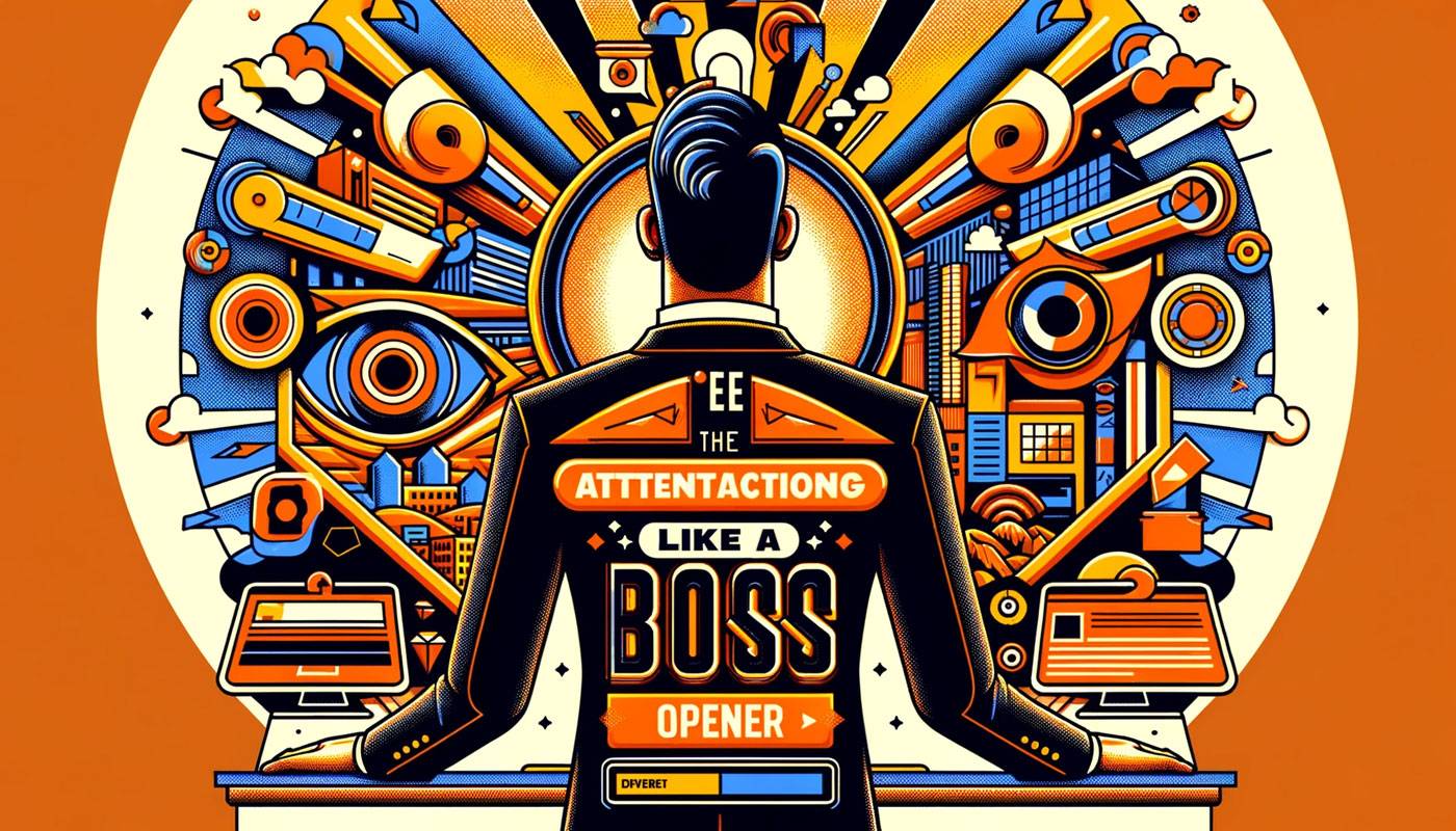
ention-Grabbing Opener’ section of the article ‘Converting Like a Boss’. The style should mimic a trendy, tech-savvy startup approach, featuring a humorous depiction of first impressions in landing page design. The image should incorporate elements that suggest innovation and humor, using a color scheme of oranges and blacks, and bold geometric patterns, creating a modern and edgy look. The image should capture the essence of captivating the audience at first glance, in line with revolutionizing web design. No text or words in the image.
2. Value Proposition or Bust: “Why You Absolutely, Positively Need This (No, Seriously)”
This is where we sell the dream – not the kind that involves winning the lottery, but close. It’s about highlighting what makes your offer as indispensable as coffee on a Monday morning.
Your value proposition should be as clear and compelling as a midnight infomercial, but with more class and less shouting. Think of it as your elevator pitch if you were stuck with Elon Musk.

DALLE 3 Prompt: Image for ‘Value Proposition or Bust’ section of the article ‘Converting Like a Boss’. Style should mimic a trendy, tech-savvy startup approach, humorously depicting the importance of a strong value proposition in landing page design. The image should include innovative elements, using a color scheme of oranges and blacks, and bold geometric patterns, creating a modern and edgy look. It should capture the essence of effectively communicating value to the audience, aligning with innovative web design. No text or words in the image.
3. The Irresistible Call to Action: “Click Here, I Dare You”
Crafting a call to action so tempting, it’s like the ‘Buy One, Get One Free’ of the digital world. This is where subtlety takes a backseat, and bold, persuasive magic happens.
Your CTA should scream ‘click me!’ louder than a teenager at a rock concert. It’s the siren song for your visitors, leading them to the treasure trove that is your offer.
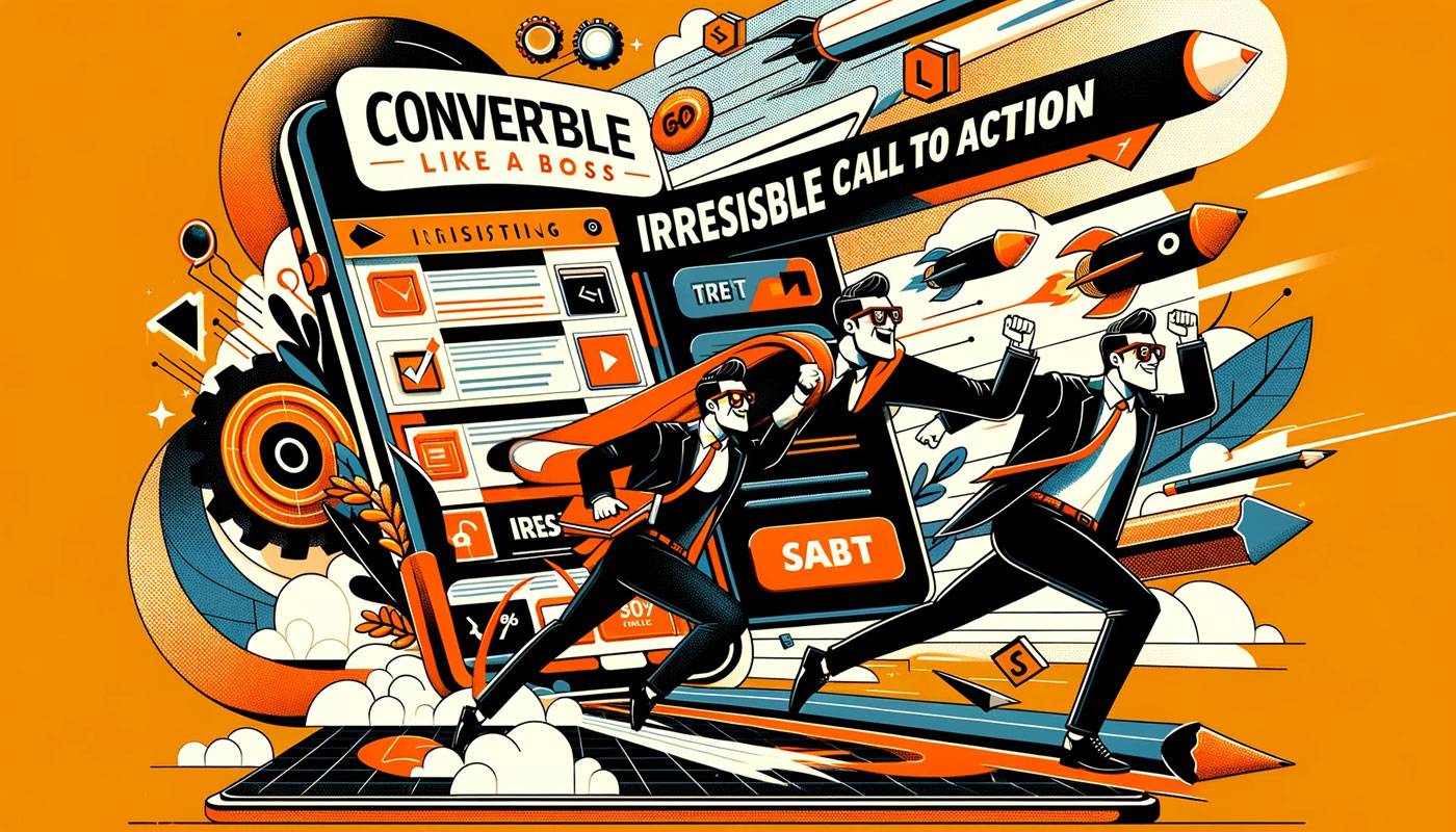
DALLE 3 Prompt: Image for ‘The Irresistible Call to Action’ section of the article ‘Converting Like a Boss’. Mimicking a tech-savvy startup style, this should humorously illustrate the power of a compelling call to action in landing page design. The image should include elements of innovation and persuasion, using a color palette of oranges and blacks, and bold geometric patterns for a modern, edgy look. It should capture the essence of prompting action in a creative and effective manner, in line with cutting-edge web design. No text or words in the image.
4. Visuals That Speak Louder Than Words: “A Picture’s Worth 1000 Conversions”
Because sometimes, words just aren’t enough (and we’re not just talking about your Tinder profile pic). We’re aiming for imagery that tells a story, paints a dream, and gives Google Images a run for its money.
Think of visuals as the secret sauce to your digital Big Mac; without them, it’s just another burger. They should capture attention like a blockbuster movie trailer – all the drama, none of the spoilers.
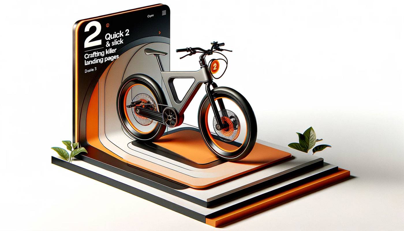
DALLE 3 Prompt: Image for Section 2 of the article ‘Quick & Slick: Crafting Killer Landing Pages in 5 Mins with DALLE 3’. Mimicking a render-based web design mockup for a funky e-bike startup, it showcases a 3D render of an e-bike in front view, rotating against a minimalist white background. The design should incorporate bold geometric patterns and a color scheme of oranges and blacks, creating a trendy and edgy look. This image captures the essence of high-tech, innovative landing page design using DALLE 3. Remove all wording and text from the image.

DALLE 3 Prompt: Image for Section 4 of the article ‘Quick & Slick: Crafting Killer Landing Pages in 5 Mins with DALLE 3’. Designed in the style of a render-based web design mockup for a funky e-bike startup, it includes a 3D render of an e-bike in front view, rotating against a minimalist white background. The design incorporates bold geometric patterns and a color scheme of oranges and blacks, epitomizing a trendy, edgy look. The image embodies the concept of high-tech, innovative landing page design using DALLE 3, with all wording and text removed.
5. Social Proof or Go Home: “Don’t Just Take Our Word For It”
Featuring testimonials and endorsements more genuine than your ex’s promise to stay friends. This is where others toot your horn so you don’t have to.
Social proof is like having your own fan club, but instead of screaming fans, you get convincing testimonials that make your offer as trustworthy as a puppy’s eyes.

DALLE 3 Prompt: Image for ‘Social Proof or Go Home’ section of the article ‘Converting Like a Boss’. The style should reflect a tech-savvy startup approach, humorously depicting the power of social proof in landing page design. The image should include elements symbolizing trust and credibility, using a color scheme of oranges and blacks, and bold geometric patterns, creating a modern and edgy look. It should capture the essence of building trust through testimonials and endorsements, in line with innovative web design. No text or words in the image.
6. The Trust-Building Section: “We’re Legit, Promise!”
Where we lay out our credentials, awards, and any cool badges we’ve earned (scout’s honor!). It’s the LinkedIn profile of your landing page, but way cooler.
This section is your chance to brag without sounding like that guy at the party who won’t stop talking about his start-up. It’s about building credibility, one humblebrag at a time.

DALLE 3 Prompt: Image for ‘The Trust-Building Section’ of the article ‘Converting Like a Boss’. Styled in a tech-savvy startup manner, it should humorously depict the importance of showcasing legitimacy in landing page design. The image should include elements that suggest security and authenticity, using a color scheme of oranges and blacks, and bold geometric patterns, for a modern and edgy look. It should capture the essence of conveying trustworthiness and reliability to the audience, in alignment with innovative web design. No text or words in the image.
7. FAQs, But Make It Fun: “Questions You Didn’t Know You Had”
Addressing all those burning questions with a touch of wit, because who said FAQs have to be boring? This is where curiosity meets clarity.
Transform your FAQs from a snooze-fest into a treasure trove of useful info, like a trivia night but with more useful answers and less beer.
8. The Final Nudge: “Last Call Before Regret”
That gentle push towards conversion, because we care (and also because we did all this work). It’s like the encore at a concert – the final chance to wow the crowd.
Here, we turn ‘maybe laters’ into ‘take my money nows’, with a nudge so persuasive, it could convince a cat to take a bath.
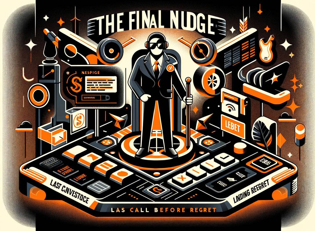
DALLE 3 Prompt: Image for ‘The Final Nudge: Last Call Before Regret’ section of the article ‘Converting Like a Boss’. The style should reflect a tech-savvy startup approach, humorously depicting the decisive moment in landing page design. The image should include elements symbolizing persuasion and urgency, using a color scheme of oranges and blacks, and bold geometric patterns, creating a modern and edgy look. It should capture the essence of a compelling final push for conversion, in line with innovative web design. No text or words in the image.
9. Footer That Doesn’t Put You to Sleep: “Yes, Even This Part Matters”
Wrapping it up with contact info and legal stuff, presented in a way that won’t bore you to tears. It’s the credits at the end of the movie – some people stick around for it.
Consider the footer your digital signature – it’s there, it’s important, and it’s the last thing they see before they leave or convert. So, make it count, like the final scene of a thriller.
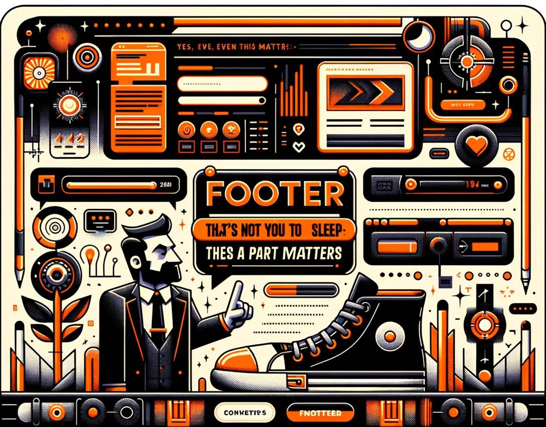
DALLE 3 Prompt: Image for ‘Footer That Doesn’t Put You to Sleep: Yes, Even This Part Matters’ section of the article ‘Converting Like a Boss’. The style should echo a tech-savvy startup, humorously portraying the importance of an engaging footer in web design. The image should include elements representing information and connectivity, using a color scheme of oranges and blacks, and bold geometric patterns, creating a modern and edgy look. It should capture the essence of an informative yet captivating footer, in line with cutting-edge web design. No text or words in the image.
Best Practices for High-Converting Landing Pages with DALLE 3
-
-
Chatting Up Your Audience with AI Personalization:
“Hello, is it me you’re looking for?” DALLE 3’s AI personalization is like a digital Cupid, matching your content to your audience’s heart’s desires. Say goodbye to one-size-fits-all and hello to ‘Wow, this page gets me!’ -
Visual Wizardry with a Click:
Unleash your inner Spielberg with DALLE 3’s visual prowess. Create eye-candy that doesn’t just look good but tells your brand’s story better than a seasoned bard. It’s like having a Hollywood studio at your fingertips – minus the celebrity tantrums. -
The Magic of Dynamic Content:
Dynamic content with DALLE 3 is like having a shape-shifting genie. It adapts faster than a chameleon at a disco, giving your users exactly what they need before they know they need it. It’s the Houdini of web design, minus the escape acts. -
A/B Testing on Steroids:
With DALLE 3, A/B testing is less guesswork, more ‘Eureka!’ You’re not just throwing spaghetti at the wall to see what sticks; you’re using laser-guided precision to find what resonates best. It’s like having a digital crystal ball, but way cooler and more accurate. -
Copy That Converts (and Charms):
Let DALLE 3 be your Shakespeare, crafting copy that speaks to souls and opens wallets. It’s about creating words that tickle the fancy and convince the skeptic, making your landing page not just a read but an experience.
There you have it – sprinkle these practices on your landing pages, and watch conversions grow like a well-watered Chia Pet. With DALLE 3, you’re not just playing the game; you’re changing it.
-
DALLE 3 Experiment – 15 User Requests for web design
Welcome to the wild world of user experiments, where we put DALLE 3 through its paces with 15 common website design requests. Spoiler alert: It’s like watching a reality show where AI is the star, and the plot twists are even better than a season finale of your favorite series.
If you are facing the challenge of maintaining consistency in your DALLE 3 designs – you’re not alone. This common hurdle can turn an exciting creative process into a tiresome chore. But here’s the good news: at Prompts Lab, we’ve crafted a solution. Check it here.
Homepage request
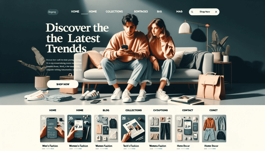
Request: Web design of a modern ecommerce homepage. A minimalist logo on the header, surrounded by menu options (Home, Collections, Blog, Contact). An image under the header of a stylish young couple browsing on their phones, with text overlay ‘Discover the Latest Trends.’ On the bottom, showcase grids of categories represented with images like ‘Men’s Fashion,’ ‘Women’s Fashion,’ ‘Tech Gadgets,’ and ‘Home Decor.’ A ‘Shop Now’ call-to-action button. The footer contains newsletter signup, links to FAQs, Shipping Information, and a site map.
Product Catalog Request
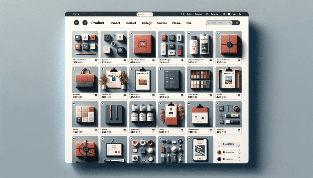
Request: Web design of a modern ecommerce ‘Product Catalog’ page for web view, consistent with the style of the previously generated mobile design. The top features a minimalist logo, a centered search bar, and a cart icon on the right. The page will be covered with content with a grid layout showcasing various products with product titles, images, names, prices, and a ‘Quick View’ button. On the right side of the page, there’s a vertical filter section. The bottom of the page has a footer with essential links and a site map.
Product Details Request
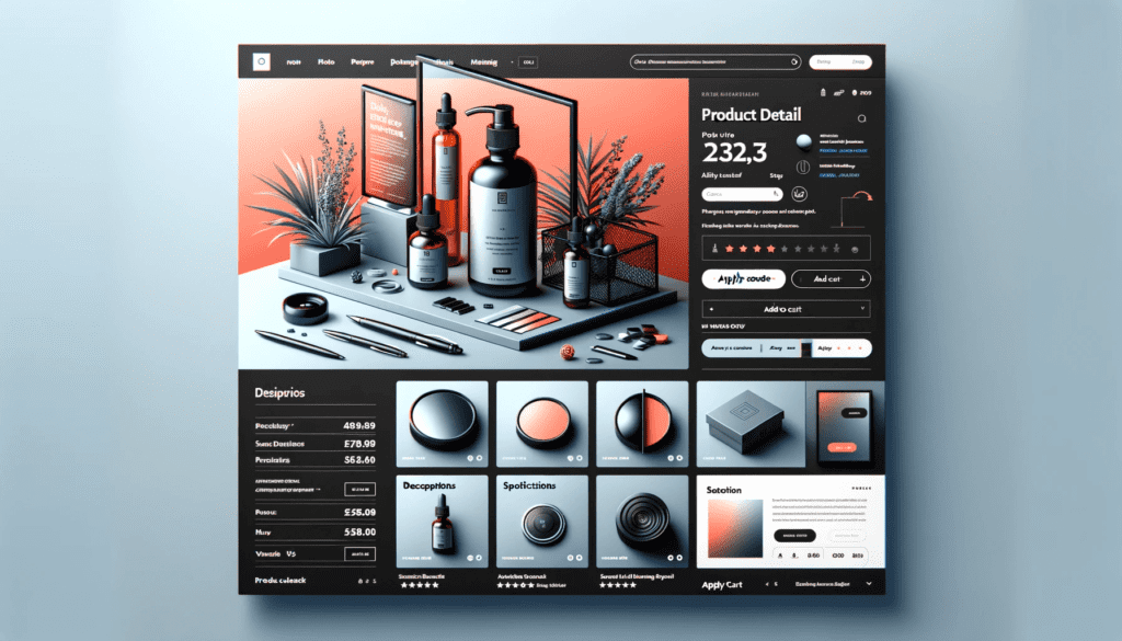
Request: Web design of a modern ecommerce ‘Product Detail’ page for web view, in line with the style and theme of the previous designs. Set the logo on the left, a centre search bar, and a cart icon on the right. The main content area covers the product image with details of it. Below this, there’s an ‘Apply Code’ option to enter discount codes. Add an “Add to Cart” button for users to purchase.

Shopping cart Request
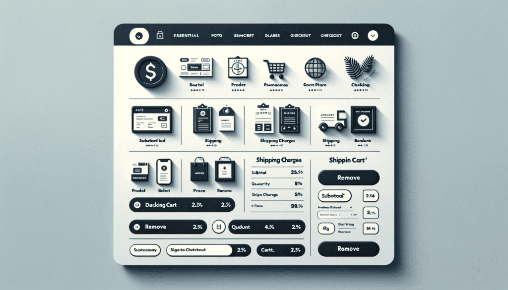
Request: Web design of a modern ecommerce ‘Shopping Cart’ page for web view, consistent with the style of the second generated image. Make the view the same as the previous one. Change the content area with the list of items added to the cart with their thumbnail images, product name, price, and quantity selector on the right. Enter the “Remove” button below each item. On the right, show the summary section with the subtotal, discount applied, shipping charges, and the final total. A “Proceed to Checkout” button below the summary.
Check out Request
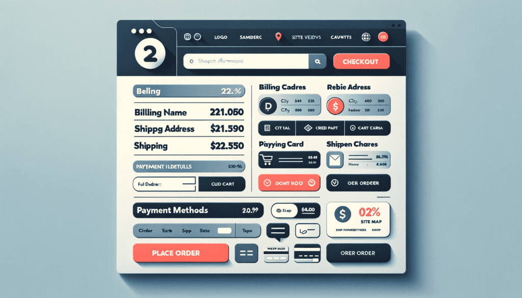
Request: Web design of a modern ecommerce ‘Checkout’ page for web view, consistent with the style and theme of the previously generated images. A top section with a logo, a centred search bar, and a cart summary icon. The content area covers the billing information, shipping address, and order summary section. The billing section provides fields of full name, email, and phone number. And a prominent ‘Place Order’ button.
User Account Request
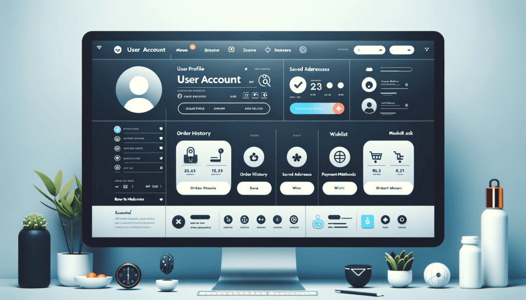
Request: Web design of a modern ecommerce ‘User Account’ page for web view, consistent with the style of the second generated image. Cover the content area with a user profile section, a profile picture, a user’s full name, and an email address. Adjacent to this, place tabbed sections of “Order History,” “Saved Addresses,” “Payment Methods,” and “Wishlist.”
Order History Request
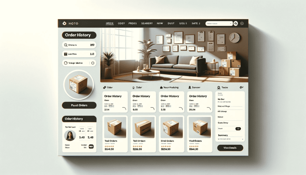
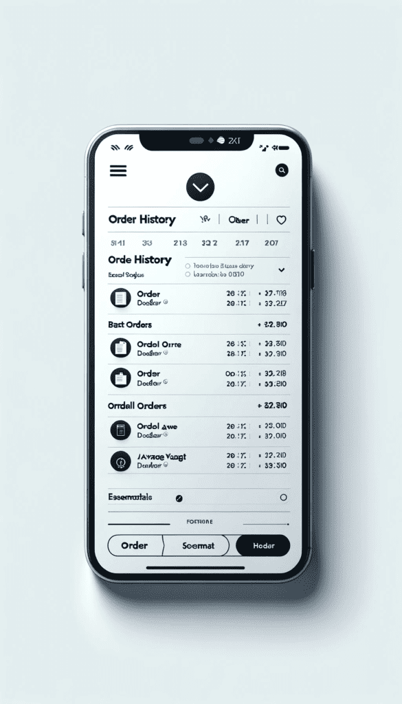
Request: Web design of a modern ecommerce ‘Order History’ page for web view, consistent with the style and theme of the previously generated images. The main content covers the title “Order History” and a list of past orders with entries and thumbnails in ascending order. On the right, showcase the summary section with total orders, the amount spent, and the average order value.
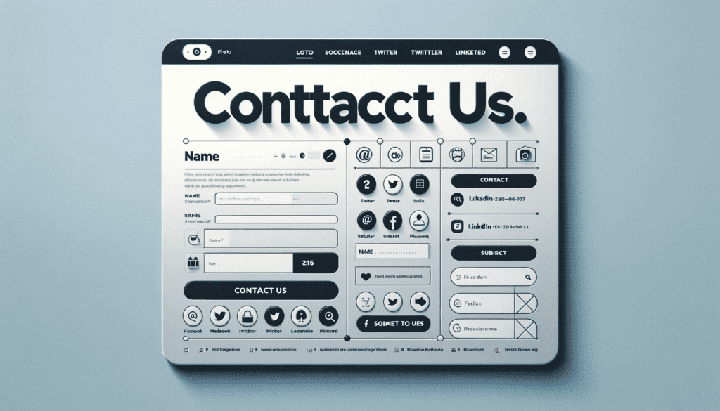
Contact Us Request
Request: Generate the web design of a modern ecommerce ‘Contact Us’ page for web view, consistent with the style of the second generated image. Show the main content area titled “Contact Us” with name, email, subject, and message. Showcase the social handles to users to reach the company.
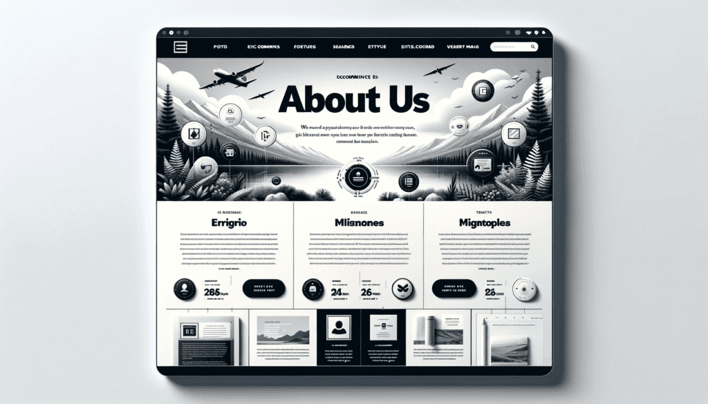
About Us Page Request
Request: Create the web design of a modern ecommerce ‘About Us’ page for web view, consistent with the style of the top-second generated image. Make the content area with the prominent title “About Us.” Show details of company owners and founders, with missions and brand’s essence. Show a timeline of the company’s growth, key events, and achievements.
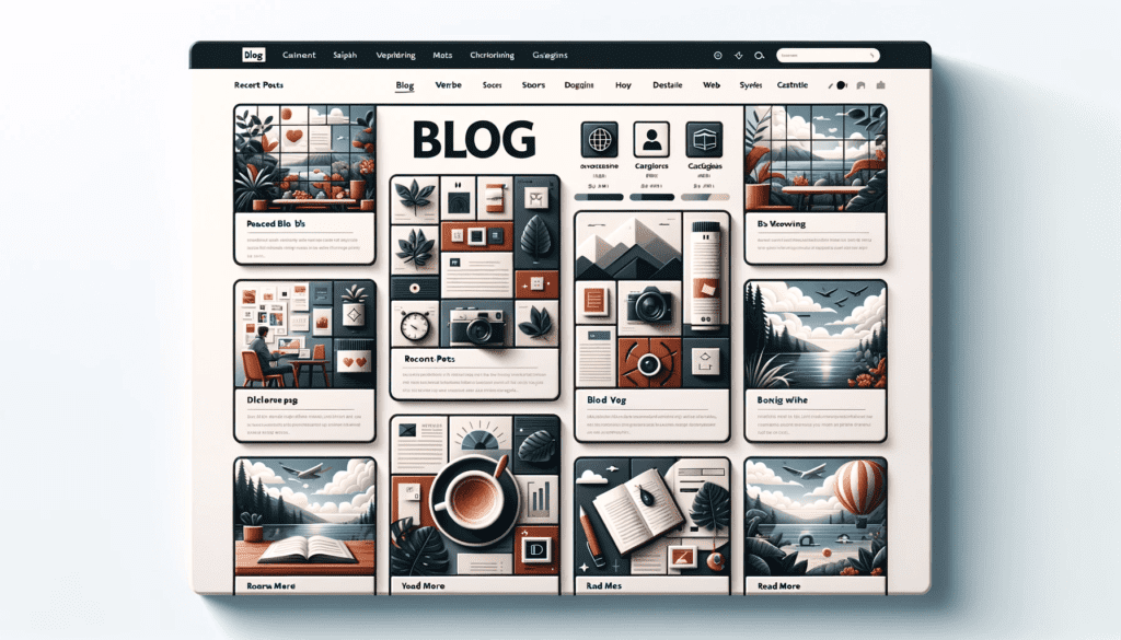
Blog Request
Request: Generate the web view of a dynamic and catchy ecommerce ‘Blog Page’, consistent with the style of the top generated images in the chat. Show blocks of posted blogs in a grid format. A high-quality image representing the blog topic, a catchy blog title in English, a summary, and a ‘Read More’ button. Mention a date stamp, and author name for each blog post. Show a “Recent Posts” section and a “Categories” to help users navigate various blog topics.

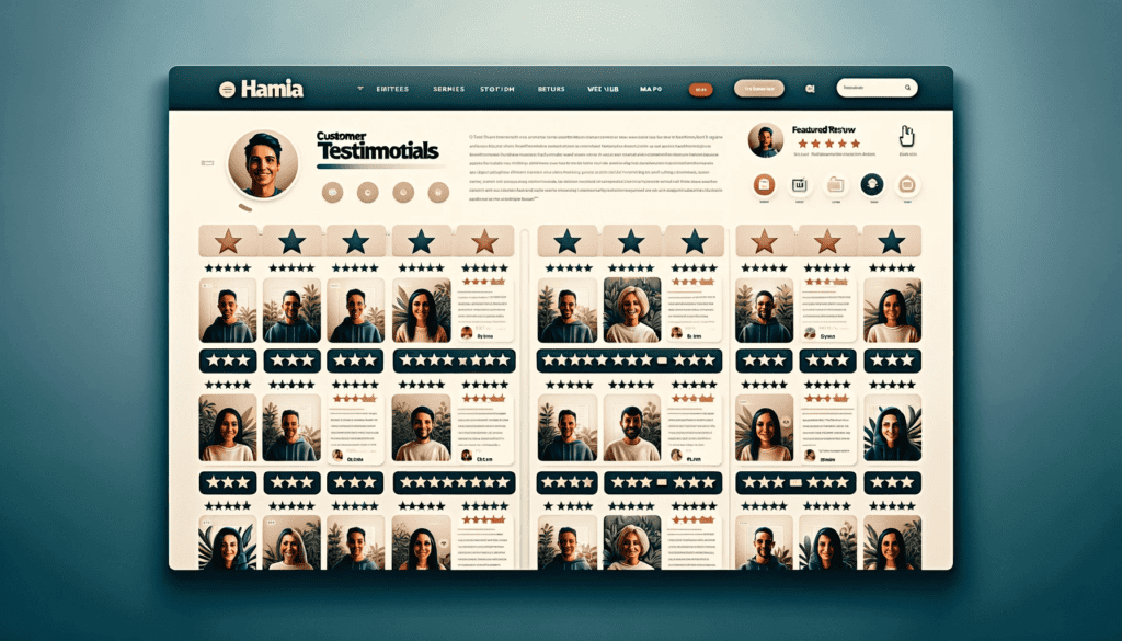
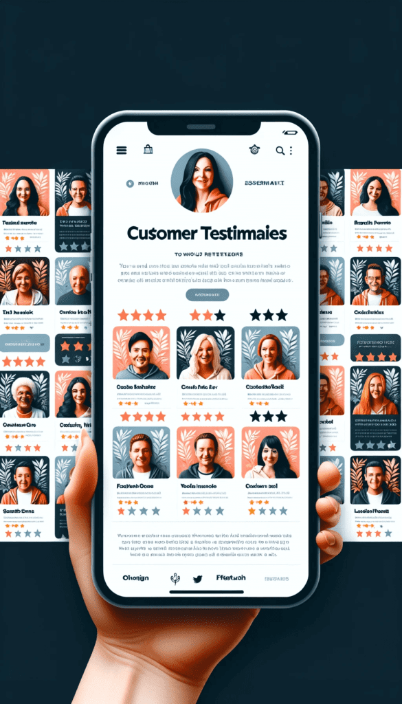
Testimonials / Reviews request
Request: Now, create the interface of the web page of a modern ecommerce “Testimonial Page,” consistent with the style of the previously generated image. The main content begins with a bold title, “Customer Testimonials.” Show organized blocks of customer reviews with a profile photo of the customer, their full name, star rating, and a brief testimonial text describing their experience with the ecommerce platform. All in grid form with a section titled ‘Featured Review’ highlighting a particularly positive review with a larger profile photo and text.
FAQs Request
Request: Create the web design of “FAQ Page” for web view, consistent with the style of the previously generated image. The main content features the title “Frequently Asked Questions.” Show organized accordion-style sections for questions in bold, and when clicked/tapped, it expands to reveal the answer. Show the “Need More Help?” section where users can find contact details or a link to the ‘Contact Us’ page.

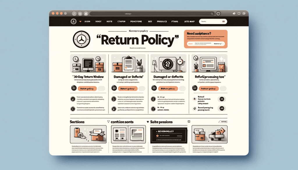
Return Policy request
Request: Generate the design of a modern ecommerce ‘Return Policy’ page for web view, consistent with the style of the previously generated images. Cover the main content area with the bold title “Return Policy.” Show an introductory paragraph explaining the general return policy by organizing sections with specific conditions and procedures. Design the “Need Assistance?” section where users can find contact details or a link to the ‘Contact Us’ page.
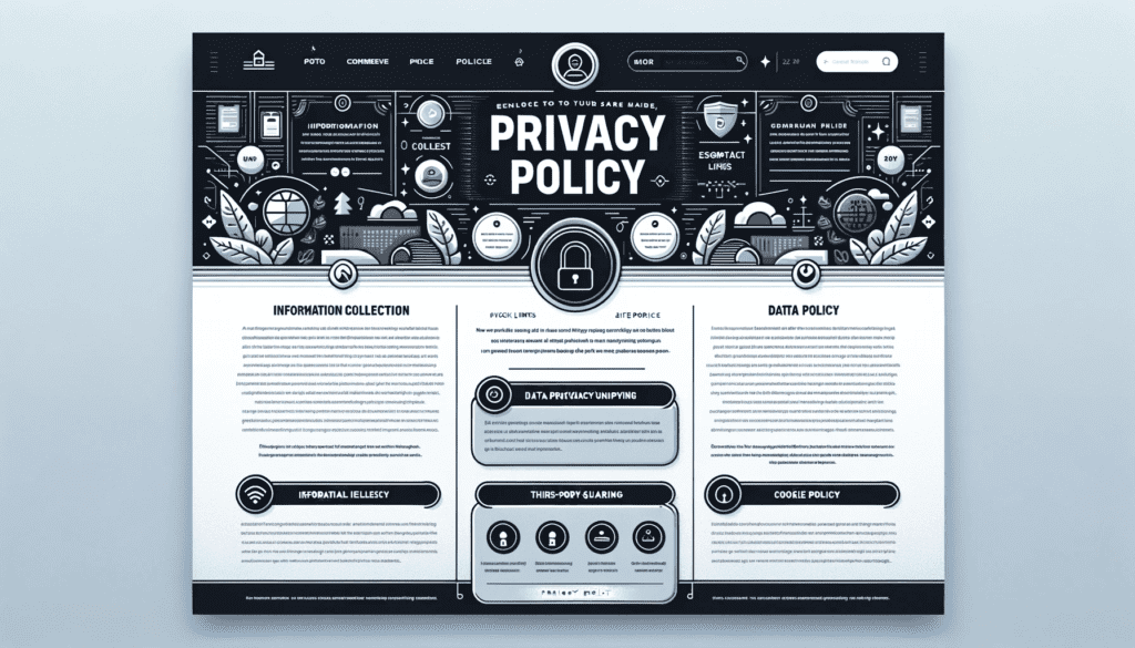
Privacy Policy request
Request: Generate the web design of a modern ecommerce ‘Privacy Policy’ page. The centre contains the title “Privacy Policy.” Showcase the introductory paragraph on user privacy and data protection and organize sections of “Information Collection,” “Data Usage,” “Third-Party Sharing,” and “Cookie Policy.”
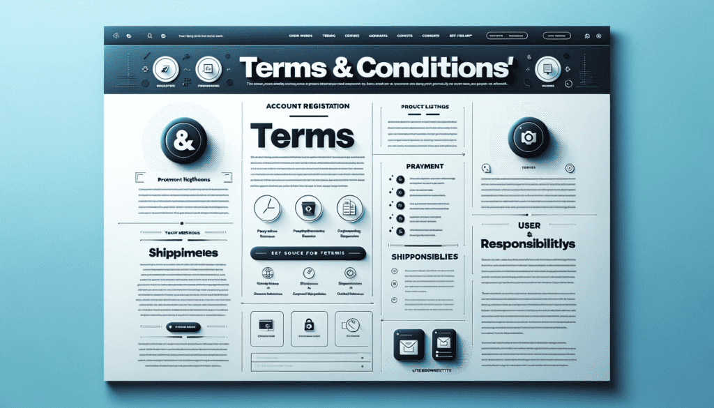
Terms & Conditions request
Request: Generate a modern ecommerce ‘Terms & Conditions’ page for web view, with a consistent theme and style of the ecommerce homepage. Mention the title at the top, with introductory, scope and purpose details. Make “Account Registration,” “Product Listings,” and ”Payment Methods” buttons. Enter the “Quick Links” section.
Conclusion
So, what have we learned? DALLE 3 isn’t just another tool in your digital toolbox; it’s the secret weapon you’ve been waiting for. Think of it as your all-access pass to the VIP club of web design, where the drinks are strong, and the websites are stronger. It’s time to step up your game and join the major leagues, where ‘good enough’ is left at the door, and ‘exceptional’ is the new standard.
